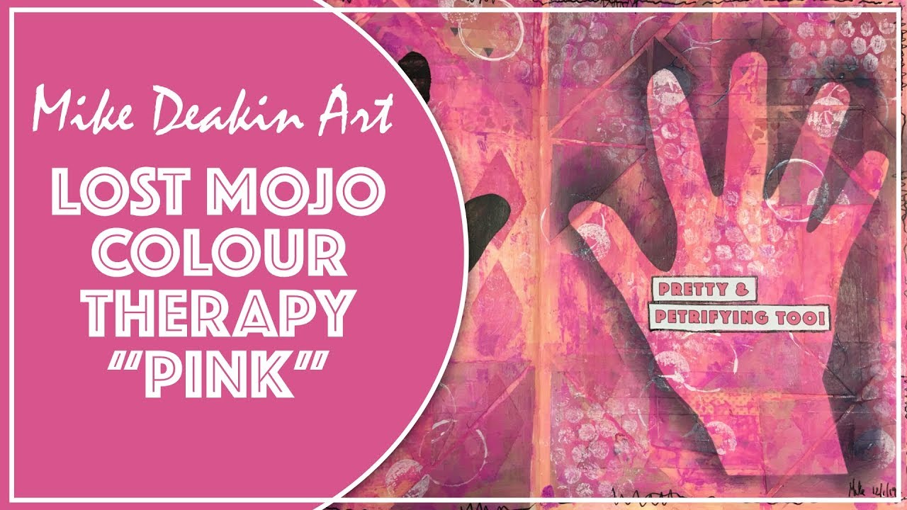
As I continue my march through the rainbow spectrum of colours to reignite my mojo, I land on the third day with Pink. A difficult colour at the best of times as there’s a huge difference in shades from light blush to deep purplish pinks – they can be both intimidating and fancy at the same time! Click to watch how I created my page and the difficulties I had in balancing the colours.
*********************************************************************
♡ Become one of my Angels and help support my YouTube channel!
*********************************************************************
Thank you so much for watching! I welcome all polite comments and I’d love to hear from you, but if you have nothing nice to say, don’t say anything at all!
More Art Journaling, Mixed Media projects and Card Making inspiration can be found by following me here:
Website & Blog: https://www.mikedeakinart.com
Facebook: https://www.facebook.com/MikeDeakinArt
#artjournalpage #mixedmediaart #mikedeakinart
source
Great work and interesting to watch! Thanks.
Pink looks great with yellow and a light aqua. You can search Google for color combos to get ideas on compositions. Like always, I love watching your videos.
Mike loved this page you showed to keep going when you don’t like a page and change it till you do. Be brave, thanks for sharing love Tracy xx
Wow…you did it! Even though it was a struggle you brilliantly pulled that pink page together. Bless you! Pink is also one of my least favorite colors.
I tried this one, it's the first one I did, I improvised and used what I had, I love it!! It looks great and thank you for your instructions, will try the orange one next cause I love that one to !
I really like your accent! It reminds me of my vacations in the UK with my daughters. I agree with you that pink is a difficult color to master. It's good for us, the audience, to see you struggle and still come out with a nice page.
This makes me think of the movie Steel Magnolias when Shelby defends her wedding colors. “My color are blush and bashful. One is deeper than the other. Lol
Thanks for sharing your struggles! Lessons learned: white paint and bubble wrap are our friends. And clear gesso is on my next shopping list! 💗
I have tried the "hand" page and Wow Mike mine never turned out this great… well mine was not even good. And you mastered this in PINK!!
Turned out fab, It might sound weird but I liked seeing you struggle but then you brought it back, it was inspiring to watch you … it helps us for when we get stuck x..
I'm just having a chuckle to myself that this was going to be a shorter video! I have to admit, I think I would have glued the pages together and moved on. Well rescued.
I think the end result and being able to see your process was worth your frustration. I hope you do also. The dark gray and black helped a lot. Thanks again for this series Mike!
It turned out well.
I love pink (and purple) but I really appreciate your willingness to bust the art doldrums AND to do it with a color you don't like. Stretching in art is a good thing, it makes the eventual success all the sweeter! Thank you for sharing this Mike ❤
Way to stay with a page! It's always interesting to see the 'struggle' and how not to give up!
This is lovely using all different shades of pink ,,,. Love the hands I have done something similar on a canvas , one in Orange for my hands , and a blue one using hubby’s hands,,,.they are on my wall in my craft room ,,. Xxxx💞🌺🌼🌸
Loving this series, especially todays. Lets me know i am nor the only one that struggles and gets frustrated. Great to see how you made it better. Thanks
So far, the “red” page has been my favorite. Although I do enjoy all of the videos to date, I am still waiting for blue & green!!! Is your mojo getting better???
I love the way the white circle on your right hand is over the ring finger. It was inspiring to see the struggle you had with this page and how you managed to bring it all together.
I love the triangles you started with…I am sure that idea will find it's way into today's play!
A difficult color pink to combine … I think it's beautiful what you made.
That was a struggle but appreciate the process. The only thing I would have done is distress the black hand a bit but that is personal taste. I love pinks and purples so I think this one is your best yet.
Enjoyed the Process of watching the battle with Pink You Won! 🙂
Loving this series! Great ideas abound!
This was one of my favorite videos because although you were at a point you clearly didnt like it as soon as you added the white to it wow. It shows us how you can have something you dont like but keep working it and eventually you get it to something that is amazing. I love how this turned out.
Awesome series Mike! Thank you for sharing your struggles and successes!♡
P.s. I keep meaning to ask you what the name of that song you used in this (& other) video called?
I struggle with pink too! I think you faced the challenge well! We just have to keep trying things so we can grow! thanks for the inspiration… I think I see a color challenge coming up for me now! ha. But do I HAVE to do pink???? ha. Great Job!
💝
I’m loving this rainbow spectrum of pages. I was thinking by the end the only colour you’ll miss is brown. So I thought of a challenge, please add a page of beige and brown. These are my problem colours and I only use them for shading when black is too dark. It will be wonderful to see the full set of pages. ❤️from Australia.
I love pink…but really dislike peach.. We all have our colors we don't like. I like pinks mixed with purples but they must be a true pink or blue pink , not one with any orange to it. Great page as always.
I like pink. This page is beautiful. I never didn 't like it. Well done!👍🎨
Not my favorite colour either, but you stepped up to the challenge pretty well I think. No pun intended.. You go, Mike.
Mike, even though you were frustrated with this page, for your subscribers it was interesting to see how you progressed. We realize how you give of your time to provide us these videos and, good or bad results, we are very appreciative of your time and efforts. One of the colors you used was a purplely color. The combination of pink and purple has always put my teeth on edge. I see women combining those colors in their clothing and it just makes me cringe! LOLOLOL!!!
Love watching your process. This is an excellent series….